Real Analysis Made Easy: Littlewood’s Three Principles

Littlewood’s Three Principles of Real Analysis Explained Simply

Littlewood’s Three Principles of Real Analysis Explained Simply

Littlewood’s three principles provide an intuitive way to understand complex ideas in real analysis. They describe how we can approximate complicated mathematical objects (sets, functions, and convergence) with simpler, more familiar ones. These principles are fundamental in measure theory and functional analysis. Let’s break each principle down in easy-to-understand terms with examples and real-world applications.

1. Lebesgue Measurable Sets are “Nearly” Open Sets

A Lebesgue measurable set might have rough edges or scattered points, but we can always find an open set that closely resembles it. This means we can work with a smoother, more well-behaved version of the set without losing much accuracy.

🔹 Analogy: Imagine drawing a shape with rough edges. You can smooth them out slightly without changing the overall shape too much.

Example: Suppose you have a set representing all people with a specific income range, but some extreme outliers exist. You can approximate this group with a slightly broader income range that excludes the outliers but still represents the majority.

2. Lebesgue Measurable Functions are “Nearly” Continuous

A continuous function has no sudden jumps. A Lebesgue measurable function may have small discontinuities, but we can approximate it with a function that is almost continuous. The problematic points are insignificant in the big picture.

🔹 Analogy: A video that plays smoothly might have one or two minor glitches, but overall, it still appears fluid.

Example: In physics, temperature variations over time may have minor recording errors. If we ignore those small inconsistencies, the temperature function behaves like a continuous one.

3. λ-a.e. Convergence is “Nearly” Uniform Convergence

Almost everywhere (λ-a.e.) convergence means a sequence of functions approaches a final function at most points, except for a few insignificant spots. While uniform convergence is stronger, almost everywhere convergence behaves very similarly.

🔹 Analogy: If a swimming pool fills up smoothly except for one tiny corner taking longer, we still say the pool is “nearly” full at the same time.

Example: In machine learning, models trained on large datasets often approximate functions that fit almost all data points, even if a few points have minor errors. The model’s convergence behaves similarly to uniform convergence.

Implications in Real-World Applications

Littlewood’s principles are essential in various fields:

  • Signal Processing: Functions approximated in frequency analysis behave nearly continuously despite noise.
  • Economics: Approximate models for demand curves often ignore extreme outliers but remain valid for policy decisions.
  • Physics: Small inconsistencies in measurement tools can often be ignored to make sense of large-scale patterns.

Applications in Investing

Littlewood’s principles also have important applications in investing and financial modeling:

  • Approximation in Financial Models: Financial datasets contain noise and outliers. By using smoother approximations, analysts can build robust models for asset pricing, economic forecasting, and risk assessment.
  • Portfolio Optimization and Risk Analysis: Investment models work on approximations of risk and return, ignoring extreme anomalies that do not significantly affect long-term strategy.
  • Machine Learning in Trading: Algorithmic trading relies on approximations, where nearly uniform convergence of predictive models allows for practical and profitable trading strategies.

Example: In portfolio management, extreme stock price fluctuations (outliers) are often disregarded in risk models to focus on long-term market trends.

Conclusion

Littlewood’s principles allow mathematicians to replace complicated objects with simpler, well-behaved versions, making real analysis more practical and accessible. They help bridge the gap between theoretical mathematics and real-world applications, including investing, risk management, and financial modeling.

Understanding Littlewood’s Principles in Real Analysis

Littlewood’s Three Principles of Real Analysis Explained Simply

Littlewood’s Three Principles of Real Analysis Explained Simply

Littlewood’s three principles provide an intuitive way to understand complex ideas in real analysis. They describe how we can approximate complicated mathematical objects (sets, functions, and convergence) with simpler, more familiar ones. These principles are fundamental in measure theory and functional analysis. Let’s break each principle down in easy-to-understand terms with examples and real-world applications.

1. Lebesgue Measurable Sets are “Nearly” Open Sets

A Lebesgue measurable set might have rough edges or scattered points, but we can always find an open set that closely resembles it. This means we can work with a smoother, more well-behaved version of the set without losing much accuracy.

🔹 Analogy: Imagine drawing a shape with rough edges. You can smooth them out slightly without changing the overall shape too much.

Example: Suppose you have a set representing all people with a specific income range, but some extreme outliers exist. You can approximate this group with a slightly broader income range that excludes the outliers but still represents the majority.

2. Lebesgue Measurable Functions are “Nearly” Continuous

A continuous function has no sudden jumps. A Lebesgue measurable function may have small discontinuities, but we can approximate it with a function that is almost continuous. The problematic points are insignificant in the big picture.

🔹 Analogy: A video that plays smoothly might have one or two minor glitches, but overall, it still appears fluid.

Example: In physics, temperature variations over time may have minor recording errors. If we ignore those small inconsistencies, the temperature function behaves like a continuous one.

3. λ-a.e. Convergence is “Nearly” Uniform Convergence

Almost everywhere (λ-a.e.) convergence means a sequence of functions approaches a final function at most points, except for a few insignificant spots. While uniform convergence is stronger, almost everywhere convergence behaves very similarly.

🔹 Analogy: If a swimming pool fills up smoothly except for one tiny corner taking longer, we still say the pool is “nearly” full at the same time.

Example: In machine learning, models trained on large datasets often approximate functions that fit almost all data points, even if a few points have minor errors. The model’s convergence behaves similarly to uniform convergence.

Implications in Real-World Applications

Littlewood’s principles are essential in various fields:

  • Signal Processing: Functions approximated in frequency analysis behave nearly continuously despite noise.
  • Economics: Approximate models for demand curves often ignore extreme outliers but remain valid for policy decisions.
  • Physics: Small inconsistencies in measurement tools can often be ignored to make sense of large-scale patterns.

Conclusion

Littlewood’s principles allow mathematicians to replace complicated objects with simpler, well-behaved versions, making real analysis more practical and accessible. They help bridge the gap between theoretical mathematics and real-world applications.

Understanding Unsupervised Learning: Benefits & Challenges

Unsupervised Learning: An Introduction

Unsupervised Learning: An Introduction

Understanding how machines find patterns on their own!

What is Unsupervised Learning?

Unsupervised learning is a type of machine learning where a computer learns patterns in data without being given specific instructions or labeled examples. Think of it as the computer exploring a puzzle on its own to find hidden patterns or structures.

Analogy: Sorting Groceries

Imagine you just got back from the store with a mix of fruits and vegetables, but you didn’t label them. Instead of sorting them yourself, you ask a computer to figure it out. The computer looks for patterns—like shape, size, or color—and groups apples, bananas, and oranges separately without knowing their names. That’s unsupervised learning!

Clustering Example

How Does It Work?

1. Clustering

The computer groups similar things together. For example, organizing photos of pets into groups like cats, dogs, and birds based on their appearance.

Clustering Example

2. Dimensionality Reduction

The computer simplifies large datasets by focusing only on the most important details. For example, compressing a high-resolution photo into a smaller file without losing the key features.

Dimensionality Reduction Example

Examples in Everyday Life

  • Music Streaming Services: Grouping songs into playlists based on patterns in sound or user preferences. For example, Spotify’s “Discover Weekly” playlist uses unsupervised learning to analyze the attributes of songs you’ve liked and suggests similar tracks.
  • E-commerce: Suggesting similar products based on what other users have bought. For example, Amazon clusters customer purchase histories to recommend products that match their interests.
  • Healthcare: Identifying subtypes of diseases by analyzing patient data. For example, unsupervised learning can group patients based on their symptoms to find patterns in rare diseases.
  • Social Media: Grouping people into communities or clusters based on shared interests. For instance, Facebook uses clustering to recommend friends or groups based on your network and interests.

Real-World Applications

  • Retail: Analyzing shopping behavior to design store layouts that maximize customer engagement and sales.
  • Finance: Detecting fraudulent transactions by identifying unusual patterns in large datasets.
  • Biology: Grouping genes with similar functions or expressions to understand genetic relationships.

Why is it Useful?

Unsupervised learning is helpful when:

  • There’s no labeled data available.
  • We want to discover unknown patterns or relationships in data.

Challenges of Unsupervised Learning

  • Hard to Evaluate: Without labeled data, it’s challenging to assess whether the patterns found are meaningful. For example, in a retail dataset, the computer might group customers in ways that don’t align with marketing goals.
  • Meaningless Patterns: The computer might find patterns that aren’t useful. For instance, it might group music playlists based on obscure attributes like file size instead of genre or tempo.

Engage with Unsupervised Learning

How do you think unsupervised learning could impact your field of interest? Can you think of any patterns in data that a computer might help uncover?

© 2025 Learn Math, Grow Your Wealth: A Guide to Financial Success. All rights reserved.

Mastering Decision Trees for Better Choices

Decision Trees: A Comprehensive Guide

Decision Trees: A Comprehensive Guide

Learn how to make smarter decisions with decision trees!

What Are Decision Trees?

A decision tree is a step-by-step diagram that helps you decide something by breaking it into smaller, manageable choices. It looks like a tree: the root is your main question, the branches are your options, and the leaves represent the outcomes.

Why Use Decision Trees?

  • Visualize Choices: See your options and outcomes clearly.
  • Predict Outcomes: Understand the consequences of your decisions.
  • Simplify Decisions: Break complex decisions into smaller steps.

Applications of Decision Trees in Various Fields

Decision trees are versatile tools used in numerous fields beyond personal finance and workouts:

  • Healthcare: Doctors use decision trees to diagnose diseases based on symptoms and test results. For example, they help determine whether a patient needs further testing or immediate treatment.
  • Education: Teachers and administrators use decision trees to personalize learning plans based on student performance and preferences.
  • Business: Companies use decision trees to evaluate strategies, such as launching new products or entering new markets.
  • Technology: Decision trees are integral to artificial intelligence and machine learning, helping algorithms classify data and make predictions.
  • Legal: Lawyers use decision trees to map out possible outcomes of a case, helping clients understand risks and benefits.
  • Environmental Science: Decision trees help in conservation efforts by evaluating factors like habitat suitability and species protection strategies.

Advantages and Disadvantages of Decision Trees

Advantages

  • Easy to Understand: The visual structure makes it simple for anyone to follow. For example, a healthcare professional can easily communicate a treatment plan to a patient.
  • Versatile: Applicable to a wide range of scenarios and fields, from business decision-making to environmental planning.
  • Supports Decision-Making: Breaks complex decisions into manageable parts, such as determining the best investment strategy based on personal goals.
  • Transparency: Clearly shows how decisions are made, making it easier to justify outcomes to stakeholders.

Disadvantages

  • Prone to Overfitting: Complex trees can be too specific and fail to generalize. For instance, a highly detailed marketing decision tree might not apply to future campaigns.
  • Data Dependency: Requires accurate and comprehensive data for reliability. A decision tree for legal case outcomes may falter if historical data is incomplete.
  • Limited Accuracy: In some cases, simpler models or advanced methods like neural networks may perform better, particularly in machine learning applications.

Real-Life Examples of Decision Trees

Decision trees are practical tools that can be applied in various real-life scenarios:

  • Healthcare: A decision tree helps a doctor decide between prescribing medication, ordering tests, or recommending rest based on a patient’s symptoms.
  • Business: Companies use decision trees to decide whether to invest in marketing campaigns or product development, considering factors like budget and market trends.
  • Environmental Science: Conservationists use decision trees to determine the best strategies for protecting endangered species based on habitat and population data.
  • Education: Teachers create decision trees to identify the best teaching method for a student based on their learning style and performance.

Build Your Own Decision Tree

  1. Define the problem: Start with your main question.
  2. List your options: Identify the choices available.
  3. Ask sub-questions: Narrow down the possibilities.
  4. Evaluate outcomes: Predict the results of each choice.

Use tools like Lucidchart, Canva, or PowerPoint to visualize your tree. For example, create a decision tree to plan your next vacation by starting with the type of experience you want (relaxation, adventure, etc.) and branching into options like destinations, budgets, and activities.

Visualizing Decision Trees

A picture is worth a thousand words. Below is a simple example of a decision tree structure:

Decision Tree Example

Automate with Python

Here’s a simple Python script to create an interactive decision tree. Each section is explained for beginners:


# This script helps users decide between Growth or Safety investments.
def choose_investment():
    print("Do you prioritize Growth or Safety?")
    preference = input("Enter Growth or Safety: ").lower()

    if preference == "growth":
        print("Great! Let’s explore your risk tolerance.")
        risk = input("How much risk can you handle? (High/Moderate): ").lower()
        if risk == "high":
            print("Consider Cryptocurrencies, Emerging Markets, or Sector-Specific Stocks.")
        elif risk == "moderate":
            print("Consider Index Funds, ETFs, or Blue-Chip Stocks.")
        else:
            print("Invalid input. Please choose High or Moderate.")
    elif preference == "safety":
        print("Safety first! Let’s check your access needs.")
        access = input("Do you need immediate access to funds? (Yes/No): ").lower()
        if access == "yes":
            print("Consider Savings Accounts or CDs.")
        elif access == "no":
            print("Consider Treasury Bonds or REITs.")
        else:
            print("Invalid input. Please choose Yes or No.")
    else:
        print("Invalid input. Please start over and choose Growth or Safety.")

choose_investment()


Glossary of Key Terms

  • Decision Tree: A diagram used to make decisions by splitting them into branches.
  • Overfitting: When a model is too complex and fails to generalize well to new data.
  • REIT: Real Estate Investment Trust, a company that owns or finances income-producing real estate.
  • Tolerance: The ability to endure risk in investment scenarios.

Further Reading

© 2025 Learn Math, Grow Your Wealth: A Guide to Financial Success.. All rights reserved.

Anisotropic Diffusion: Revolutionizing Investment Analysis

Application of Anisotropic Diffusion in Investing

Application of Anisotropic Diffusion in Investing

The anisotropic diffusion equation is widely known in fields like image processing and heat transfer, but it also has powerful applications in financial modeling. Its ability to reduce noise while preserving critical trends makes it an ideal tool for investment analysis. Below, we explore how to apply this mathematical technique to denoise stock price data and identify patterns for better decision-making.

What is the Anisotropic Diffusion Equation?

Anisotropic diffusion selectively smooths data based on local gradients, unlike standard diffusion that spreads uniformly. The equation is expressed as:

∂u/∂t = ∇ · (D(x, t) ∇u)

  • u(x, t): The state variable, such as stock prices.
  • D(x, t): Diffusion coefficient controlling rate and direction of diffusion.
  • ∇u: Gradient representing changes over space.
  • ∇ · : Divergence operator indicating net outflow.

How It Helps in Investing

Anisotropic diffusion offers several benefits for investment analysis:

  • Noise Reduction: Smooths noisy stock price data while preserving sharp trend changes.
  • Trend Detection: Helps identify support/resistance levels and breakouts.
  • Volatility Clustering: Models periods of high or low volatility for risk management.
  • Portfolio Optimization: Balances risk and return by analyzing correlations between assets.

Python Implementation Using yFinance

The following Python code demonstrates how to apply the anisotropic diffusion equation to stock prices fetched using the yfinance library:

import numpy as np
import matplotlib.pyplot as plt
import yfinance as yf

def anisotropic_diffusion(data, iterations, kappa):
    """
    Apply anisotropic diffusion to 1D stock price data.
    
    Parameters:
    - data: np.array, the 1D array of stock prices
    - iterations: int, number of iterations to perform
    - kappa: float, controls sensitivity to edges

    Returns:
    - diffused: np.array, the smoothed data
    """
    diffused = data.copy()
    n = len(data)

    for _ in range(iterations):
        for i in range(1, n - 1):
            gradient_forward = data[i + 1] - data[i]
            gradient_backward = data[i] - data[i - 1]

            flux_forward = np.exp(-gradient_forward**2 / kappa**2) * gradient_forward
            flux_backward = np.exp(-gradient_backward**2 / kappa**2) * gradient_backward

            diffused[i] += flux_forward - flux_backward

        data = diffused.copy()  # Update the data for the next iteration

    return diffused

# Fetch historical stock data using yfinance
ticker = "AAPL"  # Replace with your desired ticker symbol
data = yf.download(ticker, start="2020-01-01", end="2023-01-01", progress=False)
closing_prices = data['Close'].values  # Extract closing prices

# Apply anisotropic diffusion
iterations = 50
kappa = 1.0
smoothed_prices = anisotropic_diffusion(closing_prices, iterations, kappa)

# Plot the original and smoothed data
plt.figure(figsize=(12, 6))
plt.plot(closing_prices, label="Original Prices", alpha=0.6)
plt.plot(smoothed_prices, label="Smoothed Prices", color="red", linewidth=2)
plt.title(f"Anisotropic Diffusion on {ticker} Closing Prices")
plt.xlabel("Days")
plt.ylabel("Price")
plt.legend()
plt.grid()
plt.show()
            

Graph of Original vs. Smoothed Prices


Below is the placeholder for the graph that the code will generate:

anisotropic diffusion


Conclusion

The anisotropic diffusion equation provides a robust framework for smoothing financial data while preserving critical patterns. By leveraging tools like Python and yfinance, investors can transform noisy price data into actionable insights, enhancing their ability to detect trends and make informed decisions.

Portfolio Analysis with YFinance and Discrete Laplacian

Using YFinance and the Discrete Laplacian for Portfolio Analysis

Using YFinance and the Discrete Laplacian for Portfolio Analysis

Analyzing a portfolio’s structure is crucial for understanding risks, correlations, and diversification. The **Discrete Laplacian**, a mathematical tool from graph theory, helps us understand how interconnected assets in a portfolio influence each other. Combined with real market data fetched using **YFinance**, we can visualize correlations, compute risk metrics, and identify diversification opportunities.

What is the Discrete Laplacian?

The Discrete Laplacian is a mathematical operator that analyzes how values at a point (or node) compare to those at its neighbors in a network. It is commonly used in physics, image processing, and network analysis. In investing, the Discrete Laplacian can:

  • Highlight clusters of highly correlated assets, enabling better diversification.
  • Reveal outliers, such as assets that deviate significantly from portfolio trends.
  • Model how shocks propagate through a network of assets.

Mathematically, the Discrete Laplacian \( L \) is computed as:

\( L = D – A \)

Where:

  • D: Degree matrix (captures the number of connections for each node).
  • A: Adjacency matrix (captures the strength of connections between nodes).

Objective

In this article, we will:

  • Fetch historical market data for selected stocks using YFinance.
  • Calculate the correlation matrix and construct a portfolio graph.
  • Compute the Discrete Laplacian to analyze clusters and diversification.
  • Visualize the graph structure and interpret eigenvalues of the Laplacian.

Python Code

Below is the Python code that performs the analysis:

import numpy as np
import yfinance as yf
import networkx as nx
import matplotlib.pyplot as plt

# Define the tickers of the assets (stocks, ETFs, etc.)
tickers = ["AAPL", "MSFT", "GOOGL", "AMZN", "TSLA"]

# Fetch historical market data using yfinance
data = yf.download(tickers, start="2020-01-01", end="2023-01-01")["Adj Close"]

# Calculate daily returns
returns = data.pct_change().dropna()

# Compute the correlation matrix
correlation_matrix = returns.corr().values

# Create the adjacency matrix by thresholding correlations (e.g., > 0.5)
threshold = 0.5
adj_matrix = (correlation_matrix > threshold).astype(int)

# Create a graph from the adjacency matrix
G = nx.Graph()
for i, ticker1 in enumerate(tickers):
    for j, ticker2 in enumerate(tickers):
        if adj_matrix[i, j] and i != j:  # Avoid self-loops
            G.add_edge(ticker1, ticker2, weight=correlation_matrix[i, j])

# Compute the degree matrix and Laplacian matrix
degree_matrix = np.diag(np.sum(adj_matrix, axis=1))
laplacian_matrix = degree_matrix - adj_matrix

# Print the matrices
print("Adjacency Matrix:")
print(adj_matrix)
print("\nDegree Matrix:")
print(degree_matrix)
print("\nLaplacian Matrix:")
print(laplacian_matrix)

# Visualize the graph
pos = nx.spring_layout(G, seed=42)
plt.figure(figsize=(10, 6))
nx.draw(G, pos, with_labels=True, node_color="lightblue", edge_color="gray", node_size=2000, font_size=10)
labels = nx.get_edge_attributes(G, "weight")
nx.draw_networkx_edge_labels(G, pos, edge_labels={k: f"{v:.2f}" for k, v in labels.items()})
plt.title("Portfolio Correlation Graph")
plt.show()

# Analyze clusters using the eigenvalues of the Laplacian matrix
eigenvalues, eigenvectors = np.linalg.eig(laplacian_matrix)

# Plot the eigenvalues
plt.figure(figsize=(8, 5))
plt.bar(range(len(eigenvalues)), sorted(eigenvalues), color="blue", alpha=0.7)
plt.title("Eigenvalues of the Laplacian Matrix")
plt.xlabel("Index")
plt.ylabel("Eigenvalue")
plt.grid(True)
plt.show()

# Interpret eigenvalues
print("\nEigenvalues of the Laplacian Matrix (sorted):")
print(sorted(eigenvalues))
        

Graph Visualization

Correlation

Table of Matrices

Matrix Data

Matrix Data

Adjacency Matrix

1 1 1 1 1
1 1 1 1 0
1 1 1 1 0
1 1 1 1 1
1 0 0 1 1

Degree Matrix

5 0 0 0 0
0 4 0 0 0
0 0 4 0 0
0 0 0 5 0
0 0 0 0 3

Laplacian Matrix

4 -1 -1 -1 -1
-1 3 -1 -1 0
-1 -1 3 -1 0
-1 -1 -1 4 -1
-1 0 0 -1 2

Eigenvalues Analysis

Correlation

Conclusion

By combining **YFinance** for real market data with the **Discrete Laplacian**, we can analyze portfolio structures in a novel way. This method provides insights into correlations, diversification, and risk propagation, enabling smarter investment decisions. Try running the Python code above to visualize your own portfolio and uncover actionable insights!

Understanding Correlation Graphs and Eigenvalue Plots in Portfolio Analysis

Understanding Correlation Graphs and Eigenvalue Plots in Portfolio Analysis

Analyzing your portfolio’s structure and risk is essential for smart investing. Two powerful tools—the **correlation graph** and the **eigenvalue plot**—can provide deep insights into how your assets interact and help you optimize diversification. Let’s break down what these tools mean and how you can use them to make informed investment decisions.

The Correlation Graph

The correlation graph visually represents relationships between the assets in your portfolio. Each node represents an asset, and the edges (lines) between nodes show correlations based on historical price movements.

What It Represents

  • Nodes: Each node is an asset (e.g., a stock or ETF).
  • Edges: The lines between nodes represent significant correlations. Thicker edges indicate stronger correlations.

What to Look For

  • Highly Connected Nodes: Assets with many edges are highly correlated with others. These assets may not add much diversification.
  • Clusters: Groups of tightly connected nodes represent assets that behave similarly. These clusters often belong to the same industry or sector.

Practical Insights

  • Diversification: A well-diversified portfolio has a mix of connected and unconnected nodes.
  • Sector Analysis: Clusters highlight sectors dominating your portfolio, helping you manage concentration risks.

The Eigenvalue Plot

The eigenvalue plot, derived from the Laplacian matrix of the graph, provides a quantitative way to analyze the structure of your portfolio’s correlation network.

What Are Eigenvalues?

Eigenvalues measure how connected or clustered the graph is. In investing terms, they describe how risk or relationships are distributed across your portfolio.

What the Plot Shows

  • Small Eigenvalues (Close to Zero): Indicate weak connections or independent clusters in the graph. A zero eigenvalue represents a completely disconnected group of assets.
  • Large Eigenvalues: Suggest strong connections within the graph, which could lead to concentrated risks.

Practical Insights

  • Clustering: Spread-out eigenvalues indicate a mix of tightly connected and independent assets, which is ideal for diversification.
  • Diversification: Many small eigenvalues suggest better diversification because assets are less connected.
  • Risk Propagation: Higher eigenvalues might signal areas where risks could spread quickly through the portfolio.

Example Interpretation

Correlation Graph

Imagine your portfolio contains five assets:

  • AAPL (Apple), MSFT (Microsoft), GOOGL (Google): These assets are tightly connected, indicating similar behavior.
  • AMZN (Amazon): Fewer connections suggest it’s less correlated, providing some diversification.
  • TSLA (Tesla): An isolated node shows it moves independently of the other assets, which is great for diversification.

This graph suggests your portfolio might be overly concentrated in tech stocks (AAPL, MSFT, GOOGL). Adding less connected assets like TSLA or stocks from different sectors could improve diversification.

Eigenvalue Plot

– **Small Eigenvalues:** Suggest independent clusters or unconnected assets, which indicate good diversification.
– **Large Eigenvalues:** Show highly connected clusters, which could lead to systemic risks if those clusters dominate the portfolio.

Key Takeaways

  • Correlation Graph: Visualize relationships between assets and identify clusters or sectors dominating your portfolio.
  • Eigenvalue Plot: Quantify the degree of diversification and connectivity in your portfolio to manage risks effectively.

By combining these tools, you can build a well-diversified portfolio, reduce concentration risks, and understand how assets interact in your investments. These insights help you make more informed and strategic financial decisions.

How the Discrete Laplacian Analyzes Data Differences

What is a Discrete Laplacian?

What is a Discrete Laplacian?

The **Discrete Laplacian** is a mathematical tool used to understand how things like heat, energy, or information spread across a network, grid, or surface. It’s the discrete version of the **Laplacian**, which measures differences or changes in continuous systems, like temperature across a field. The Discrete Laplacian applies these ideas to systems with distinct points, such as pixels in an image or nodes in a network.

The Real-World Idea Behind a Laplacian

Imagine you’re standing in a field with a thermometer, and you want to know how the temperature changes around you. The Laplacian tells you how the temperature at your spot compares to the average temperature nearby:

  • If your temperature is higher than your neighbors, the Laplacian gives a positive value.
  • If it’s lower, the value is negative.
  • If it’s about the same, the Laplacian is close to zero.

This makes the Laplacian a great way to measure how “different” or “uneven” something is compared to its surroundings.

What is a Discrete Laplacian?

The Discrete Laplacian works the same way but for systems where data is defined at specific points. These points could be:

  • **Pixels in an image**: To analyze brightness differences.
  • **Nodes in a network**: To study how signals or data move.
  • **Grids or meshes**: To simulate things like heat or water flow.

How Does it Work?

The Discrete Laplacian compares the value at a point to the values at its neighbors, calculating the difference to show how a value spreads or changes.

Example 1: On a Grid

Imagine a square grid where each point represents a temperature reading. The Discrete Laplacian at one point measures how its temperature compares to the average temperature of its neighbors (above, below, left, and right).

Example 2: On a Network

In a social network, the Discrete Laplacian could measure how different your opinion is compared to the opinions of your friends. A large value indicates you’re an outlier in the network.

What Does It Tell Us?

The Discrete Laplacian is like a magnifying glass for differences, helping us answer questions like:

  • Where are the big changes happening?
  • How evenly are things distributed?
  • How does a system evolve over time?

Why is the Discrete Laplacian Important?

The Discrete Laplacian is used in many fields because it’s a simple and powerful way to study how values change in discrete systems:

  • Image Processing: Detect edges in an image by highlighting where brightness changes.
  • Network Analysis: Study how signals, data, or opinions flow in a network, such as the internet or social media.
  • Simulations: Model heat transfer, vibrations, or water flow in materials and systems.
  • 3D Modeling: Smooth surfaces or identify key features of 3D shapes in computer graphics.

A Simple Analogy: The Weather

Think of the Discrete Laplacian as a weather tool:

  • It compares the temperature at one weather station to nearby stations.
  • If your station is much hotter or colder than the nearby ones, it suggests something unusual, like a heatwave or a cold front.
  • If all stations are similar, it shows stability.

Similarly, the Discrete Laplacian detects changes, imbalances, or patterns in grids, networks, and other discrete systems.

Conclusion

The Discrete Laplacian is a mathematical tool that highlights differences and patterns in discrete data, whether it’s on a grid, a network, or another structure. It’s used in image processing, network analysis, simulations, and more. Whether you’re analyzing heat flow, processing images, or studying social networks, the Discrete Laplacian acts like a detective, finding where things are changing or uneven.

Maximize Crypto Profits with Discrete Differential Geometry Techniques

Applying Discrete Differential Geometry to Cryptocurrency Investing

Applying Discrete Differential Geometry to Cryptocurrency Investing

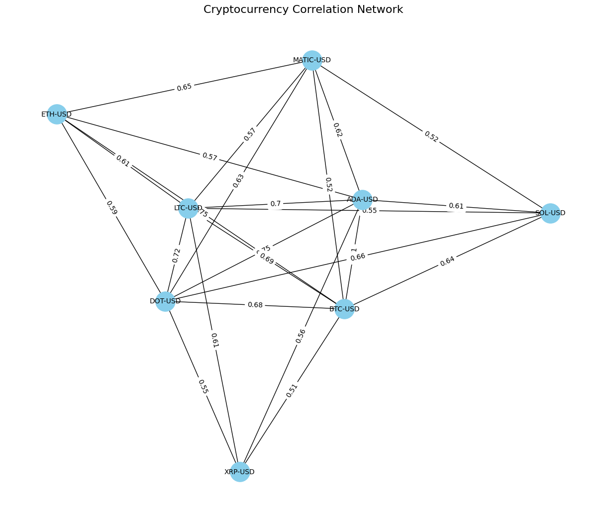
**Discrete Differential Geometry (DDG)** concepts, such as graph Laplacians and clustering analysis, can be applied to cryptocurrency investing to analyze correlations, optimize diversification, and manage risks. By constructing a financial network of cryptocurrencies based on historical data, investors can gain deeper insights into market relationships and clusters of assets. This article provides an in-depth guide and Python implementation.

Key Steps in the Analysis

To apply DDG principles to cryptocurrency investing, the following steps are performed:

  • Fetch Historical Data: Use yfinance to retrieve historical cryptocurrency price data.
  • Calculate Correlation Matrix: Analyze relationships between daily returns of cryptocurrencies.
  • Create a Financial Network: Build a graph where nodes represent cryptocurrencies, and edges represent strong correlations.
  • Calculate Graph Laplacian: Analyze the network structure using the Laplacian matrix.
  • Cluster Analysis: Use eigenvalues of the Laplacian to identify independent clusters of cryptocurrencies.
  • Visualize the Network: Plot the graph to reveal clusters and diversification opportunities.

Python Implementation

The following Python code demonstrates how to implement the above steps:

import numpy as np
import pandas as pd
import networkx as nx
import matplotlib.pyplot as plt
from scipy.linalg import eigh
import yfinance as yf

# Fetch Historical Data Using yfinance
def fetch_crypto_data_yfinance(tickers, start_date, end_date):
    data = yf.download(tickers, start=start_date, end=end_date)['Adj Close']
    return data

# Calculate Correlation Matrix
def calculate_correlation_matrix(price_data):
    daily_returns = price_data.pct_change().dropna()
    return daily_returns.corr()

# Create Financial Network
def create_financial_network(correlation_matrix):
    graph = nx.Graph()
    for i, asset1 in enumerate(correlation_matrix.columns):
        for j, asset2 in enumerate(correlation_matrix.columns):
            if i  0.5:
                graph.add_edge(asset1, asset2, weight=correlation_matrix.iloc[i, j])
    return graph

# Calculate Graph Laplacian
def calculate_graph_laplacian(graph):
    return nx.laplacian_matrix(graph).toarray()

# Analyze Clusters Using Eigenvalues
def analyze_clusters(laplacian, crypto_names):
    eigenvalues, _ = eigh(laplacian)
    print("Eigenvalues of the Laplacian:", eigenvalues)
    return np.sum(eigenvalues > 1e-5)

# Visualize the Financial Network
def plot_financial_network(graph):
    pos = nx.spring_layout(graph, seed=42)
    nx.draw(graph, pos, with_labels=True, node_size=800, node_color="skyblue", font_size=10)
    edge_labels = nx.get_edge_attributes(graph, 'weight')
    nx.draw_networkx_edge_labels(graph, pos, edge_labels=edge_labels)
    plt.title("Cryptocurrency Correlation Network")
    plt.show()

# Main Execution
if __name__ == "__main__":
    tickers = ["BTC-USD", "ETH-USD", "SOL-USD", "XRP-USD", "DOT-USD", "ADA-USD", "MATIC-USD", "LTC-USD"]
    start_date = "2023-09-01"
    end_date = "2023-12-01"

    price_data = fetch_crypto_data_yfinance(tickers, start_date, end_date)
    correlation_matrix = calculate_correlation_matrix(price_data)
    financial_network = create_financial_network(correlation_matrix)
    plot_financial_network(financial_network)
    laplacian = calculate_graph_laplacian(financial_network)
    num_clusters = analyze_clusters(laplacian, correlation_matrix.columns)
    print(f"Suggested number of clusters: {num_clusters}")
    

Key Outputs

1. Price Data

Historical adjusted closing prices for cryptocurrencies, retrieved using yfinance.

2. Correlation Matrix

A symmetric matrix showing the relationships between daily returns of cryptocurrencies.

3. Cryptocurrency Network Visualization

A graph where nodes represent cryptocurrencies, and edges represent strong correlations. network

4. Graph Laplacian and Clusters

The Laplacian matrix reveals the structure of the financial network. Eigenvalues identify the number of independent clusters, helping to diversify investments.

Applications in Cryptocurrency Investing

  • Portfolio Diversification: Identify clusters of highly correlated cryptocurrencies to avoid redundancy.
  • Risk Management: Detect systemic risks by analyzing interdependencies.
  • Adaptive Strategies: Dynamically adjust portfolio weights based on evolving clusters.

Conclusion

By applying DDG concepts like graph Laplacians and clustering, cryptocurrency investors can gain valuable insights into market relationships and manage portfolios more effectively. This framework enables better diversification, risk management, and adaptability in volatile crypto markets.

Modeling CAR T Cells: Discrete Differential Geometry Explained

Discrete Differential Geometry in CAR T Cell Research

Discrete Differential Geometry in CAR T Cell Research

Discrete Differential Geometry (DDG) offers powerful mathematical tools to model, simulate, and analyze CAR T cell interactions with tumor environments. This article explores how DDG can be used to study the geometry of tumors, the dynamics of CAR T cell migration, and signal propagation during cancer immunotherapy.

Overview of the Illustration

The simulation covers the following aspects:

  • Simulating the tumor surface using a 2D mesh grid.
  • Calculating discrete Gaussian curvature to understand tumor surface geometry.
  • Simulating CAR T cell signal propagation using diffusion models on the grid.

Python Code for the Illustration

The following Python code demonstrates these concepts step by step:

import numpy as np
import matplotlib.pyplot as plt
from scipy.sparse import diags

def generate_tumor_surface(size, height_variation):
    x, y = np.meshgrid(np.linspace(-1, 1, size), np.linspace(-1, 1, size))
    z = height_variation * (np.sin(3 * np.pi * x) * np.sin(3 * np.pi * y))
    return x, y, z

def calculate_gaussian_curvature(x, y, z):
    dz_dx = np.gradient(z, axis=1)
    dz_dy = np.gradient(z, axis=0)
    d2z_dx2 = np.gradient(dz_dx, axis=1)
    d2z_dy2 = np.gradient(dz_dy, axis=0)
    dz_dxdy = np.gradient(dz_dx, axis=0)
    numerator = d2z_dx2 * d2z_dy2 - dz_dxdy**2
    denominator = (1 + dz_dx**2 + dz_dy**2)**2
    return numerator / denominator

def simulate_signal_propagation(grid_size, source_position, diffusivity, steps):
    n = grid_size**2
    laplacian = diags([-1, -1, 4, -1, -1], [-grid_size, -1, 0, 1, grid_size], shape=(n, n))
    signal = np.zeros((grid_size, grid_size))
    signal[source_position] = 1
    signal_flat = signal.flatten()
    for _ in range(steps):
        signal_flat = signal_flat + diffusivity * laplacian.dot(signal_flat)
    return signal_flat.reshape((grid_size, grid_size))

grid_size = 50
height_variation = 0.5
source_position = (25, 25)
diffusivity = 0.01
steps = 100

x, y, z = generate_tumor_surface(grid_size, height_variation)
gaussian_curvature = calculate_gaussian_curvature(x, y, z)
signal_propagation = simulate_signal_propagation(grid_size, source_position, diffusivity, steps)

fig = plt.figure(figsize=(15, 5))
ax1 = fig.add_subplot(131, projection='3d')
ax1.plot_surface(x, y, z, cmap='viridis')
ax1.set_title("Tumor Surface")
ax2 = fig.add_subplot(132)
c2 = ax2.imshow(gaussian_curvature, cmap='jet', origin='lower')
ax2.set_title("Gaussian Curvature")
fig.colorbar(c2, ax=ax2)
ax3 = fig.add_subplot(133)
c3 = ax3.imshow(signal_propagation, cmap='plasma', origin='lower')
ax3.set_title("Signal Propagation")
fig.colorbar(c3, ax=ax3)
plt.tight_layout()
plt.show()
    

Visual Outputs

The code generates three key visualizations:

  1. Tumor Surface: A 3D plot representing the tumor’s geometry.
  2. Gaussian Curvature: A heatmap highlighting areas of high and low curvature.
  3. Signal Propagation: A heatmap showing the diffusion of CAR T cell signals across the tumor grid.

Tumor Surface Visualization

Tumor Surface

Gaussian Curvature Heatmap

Gaussian Curvature

Signal Propagation Heatmap

Signal Propagation

Conclusion

By combining Discrete Differential Geometry and computational simulations, researchers can gain deeper insights into CAR T cell behavior and improve therapeutic strategies. The Python illustration provides a foundation for exploring these concepts further in cancer immunotherapy.

Why Explainable AI Matters: Trust and Fairness in Algorithms

Explainable AI: Making Artificial Intelligence Understandable for Everyone

Artificial intelligence (AI) is becoming part of our everyday lives, but it often feels like a “black box”—we see the results, but we don’t always understand how those decisions were made. Explainable AI (XAI) aims to make AI more transparent and understandable to everyone. In this post, we’ll break down what explainable AI is, why it matters, and how it works in easy-to-understand terms.

What is Explainable AI?

Explainable AI (XAI) is a way to make AI systems more understandable to people. Imagine a super-smart computer program making decisions, like approving loans or diagnosing health conditions. Sometimes these decisions seem mysterious because AI models are complex. Explainable AI helps open this “black box” by breaking down how and why decisions are made, giving us insights that make sense.

Why is Explainable AI Important?

Explainable AI is crucial, especially in fields like healthcare, finance, and law, where AI decisions impact people’s lives. Here’s why it matters:

  • Trust and Transparency: When we understand why AI made a decision, we’re more likely to trust it. For example, if a loan application is denied, explainable AI can show which factors contributed to the decision, like credit score or income level.
  • Fairness and Accountability: AI systems can sometimes make biased decisions. Explainable AI helps identify and correct these biases to ensure fair outcomes.
  • Better Decision-Making: Explainable AI helps people make more informed choices. A doctor might use it to understand a medical diagnosis made by AI before deciding on the next steps.
  • Legal Compliance: In some industries, regulations require that AI-based decisions be explainable, ensuring that AI is accountable and fair.

How Does Explainable AI Work?

Explainable AI uses different methods to make complex models easier to understand. Here are some common approaches:

1. Feature Importance

Feature importance shows which factors were most influential in an AI decision. For example, if AI predicts a high house price, it might explain that the location and size of the house were the main contributors.

2. Model Simplification

Complex AI models can be simplified to create approximate, easy-to-understand explanations. This is like using a quick sketch to explain a complex idea—it provides the basics without overwhelming details.

3. Counterfactual Explanations

Counterfactuals help explain decisions by asking “what if” questions. For example, if a loan is denied, a counterfactual explanation might show that if the applicant had a slightly higher income, the loan would have been approved.

4. Visualizations

Explainable AI can use visuals to show how decisions were made. For example, a medical AI model might highlight areas on a scan that were important for diagnosing a condition, making it easier for doctors to understand and verify the decision.

Examples of Explainable AI in Action

Explainable AI is already making a difference in various fields. Here are a few examples:

  • Healthcare: AI can help predict a patient’s risk for certain diseases. Explainable AI shows how factors like family history, age, and lifestyle contributed to the prediction, allowing doctors to make informed choices.
  • Finance: In credit applications, explainable AI can clarify why an application was approved or denied, listing factors such as income level, credit history, and debt levels, ensuring transparency and fairness.
  • Hiring: Some companies use AI to screen job applications. Explainable AI shows why certain candidates are shortlisted, helping to ensure fair and unbiased hiring processes.
  • Self-Driving Cars: Explainable AI helps engineers understand why an autonomous vehicle made certain decisions, like braking or accelerating, which is crucial for improving safety features.

Challenges of Explainable AI

While Explainable AI is essential, it also comes with challenges:

  • Balancing Simplicity and Accuracy: Making a model easier to understand can sometimes reduce its accuracy, like simplifying a complex recipe and leaving out some details.
  • Audience-Specific Explanations: What’s understandable to a data scientist may not be as clear to a general user, so XAI needs to create explanations suited for different audiences.
  • Complexity of Some Models: Certain models, like deep learning, are so intricate that explaining them fully can be difficult. In these cases, simplified explanations may be provided.

Final Thoughts

Explainable AI is the key to making AI systems more transparent, fair, and trustworthy. By showing people how and why AI makes decisions, explainable AI builds confidence and ensures that these systems are used responsibly across various industries.